Utilizing Color Maps for understanding machining outcomes
Consider this airfoil. It was programmed and machined on a 5-Axis mill, using a single setup. The ball mill was able to travel completely around the shape, during the machining process and therefore blending the top and bottom of the surface didn’t need to be considered.
Our job is to inspect the airfoil and make suggestions to the CNC Programmer and Tool Designer to optimize the machining process.
So, the first step is to review a color map of the machined part as compared to the nominal CAD model to see where we start losing tolerance.
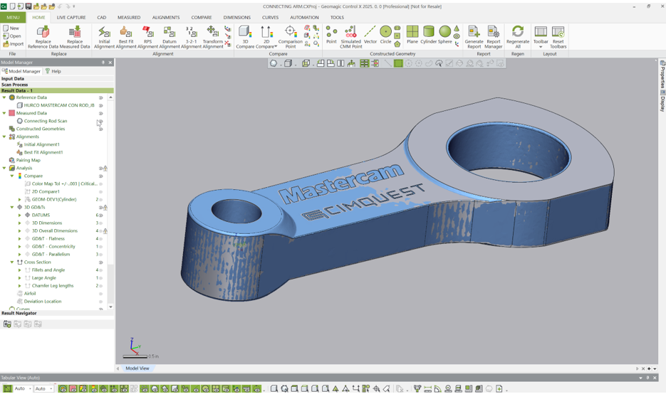
The image below shows the datum alignment of the machined part’s scan to the nominal CAD model. Once aligned, our color mapping analysis can commence.

Using Control X, we generate a color map, using a Specific (nominal) Tolerance of +/-.010” and a Min and Max Range of +/-.025”. The green geometry shown in the color map are areas of the model that fall within our acceptable tolerance band. But those areas that are trending to yellow/orange/red fall somewhere between +.010” and +.025”.

We can see from the image above that the forward section of the blade is trending to a full (oversized) condition. Additionally, we can further see that the yellow color near the middle of the airfoil is light yellow and as you travel closer to the front of the blade, the yellow becomes a darker yellow and starts transitioning to orange. Just this image alone is an indicator that the full condition worsens as we approach the front edge of the airfoil.
If we flip the part over, we can obtain more valuable information from the color map.
While the top, front side of the airfoil is full, the lower front side is undersize, which could be an indication of an alignment issue. It may also be due to a variation of cutting forces as the tool rolls over the part.

We can further see that not only is the front portion of the airfoil undersize and the rear portion near the base is oversize, but we can also determine the trend of the surface based upon the color map intensity. From the middle of the blade and moving towards the front, the color map is becoming a darker shade of blue, indicating that the machined surface becomes more undersized as we approach that front area.
Conversely, moving from the center to the rear base of the airfoil, the machined surface becomes more oversized, full from the nominal CAD model. The yellow/orange/red/dark red transition tells us this.
These initial findings suggest to us that the likely causes here are either a poor alignment and perhaps a fixturing issue, allowing the part to move during the machining process. Or maybe the cutting forces vary as the cutter traverses around the part and therefore cause the ball mill to deflect on one side and be drawn in on the opposite. But at least it can get us thinking as to how we can produce a better part and what may be causing our part to be machined OOT.
To further validate how the machined part is trending, let’s place a few Comparison Points onto the model and ask Control X for those local deviation values.
Below I’ve placed three Comparison points onto the back face of the airfoil and three on the front face. Notice how the deviation values validate the color map. The full condition closer to the rear base trend from roughly a deviation of +.0099” to +.0156” to +.0255” full (i.e. increasing in deviation, corroborating the color map image) whereas the undersize condition trends from -.0092” to -.0178” to -.028”, further corroborating the image results.
Notice also how the colors displayed on the Comparison Point Tags match the color scheme on the color map. So just seeing the colors alone can teach us how the machined part is trending.

2D Color Maps, known as Whisker Plots, can also be very informative in identifying machining issues. Whisker plots are planar color maps.
If we consider the image below, A plane is defined a small distance back from the front edge of the airfoil. A Whisker Plot is then created at that intersection.

Looking ‘true’ to the Whisker plot section, we can see the trends on both sides of the airfoil in a single, flat image. At that planar location, we can see that the airfoil is generally in an oversize condition on the topside and undersize on the bottom.
The color and length of each Whisker shows us specifically what is happening at this planar section during the machining process.
If we zoom into the front area and hover the mouse over one of the Whiskers, Control X returns the Whisker length, indicating that local deviation of machined surface to nominal CAD model. We can even see the ‘crossover’, where the part is undersize yet within tolerance, and where it transitions to oversize, within tolerance. We can also see where the part transitions to being on OOT on both the lower and upper sections.
So, without placing a single linear dimension on the model, the 3D and 2D color mapping tools in Control X as well as validating the Color Map with Comparison Points can offer great insight as to what is taking place during the machining process, thus exposing various conditions to explore for the CNC programmer and Tool Designer.
Please contact Cimquest with any questions.

Leave A Comment