Let’s take a look at how to interpret 3D and 2D color maps using inspection software. Non-contact inspection software that is designed to show color maps will align the scan of a manufactured part with a nominal CAD model and actual manufacturing tolerances are revealed in a clear, easy to interpret fashion. Some products can show a blended color map whereby a color (typically green) represents a nominal tolerance.
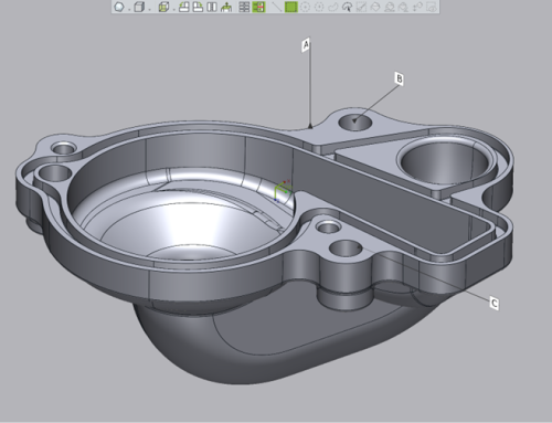
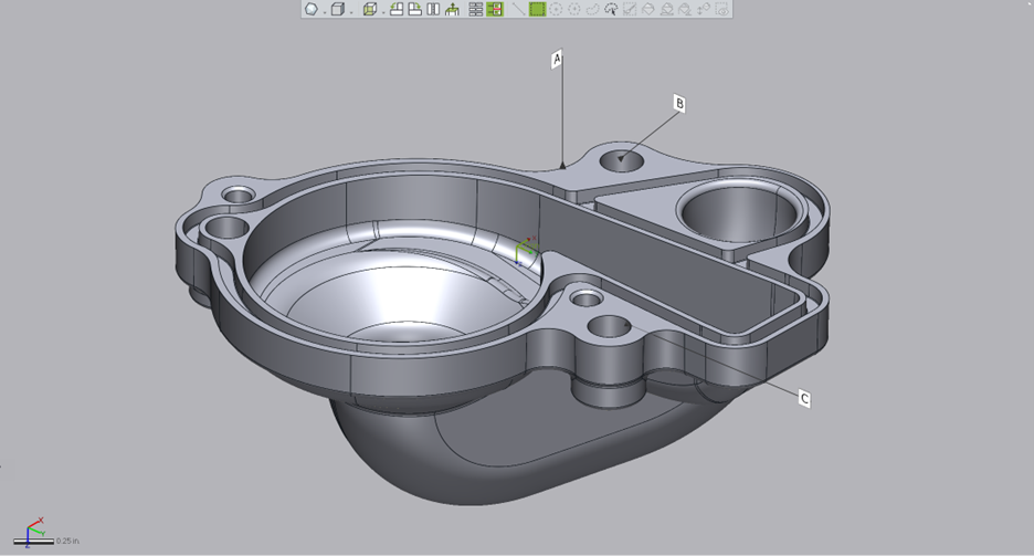
For the connecting arm color map in the example below, the green color is revealing the areas whereby the deviation from the scan to machined part is +/-.005”, the nominal value.
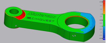
Critical tolerances may also be shown that exceed nominal but reveal what is happening during the manufacturing process. In this case, critical tolerances are set to +/-.010”.
Areas trending towards yellow, orange, then red are in between high nominal and high critical (between +.005” and +.010”). The closer to red, the further we are to approaching the critical tolerance ‘full’ (oversize) values. Conversely, the light to dark blue colors are showing where the model is trending between -.005” and -.010” or undersize values.
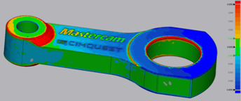
By increasing the nominal tolerance to +/-.001” and the critical tolerance to +/-.005”, we get the results (below). You can see that a much smaller percentage of the machined model fell within +/-.001” and can see more of a trend with regards to machining tolerances obtained. While two of the top flat areas are within +/-.005”, when the nominal is changed to +/-.001”, the faces are shown now as undersize.
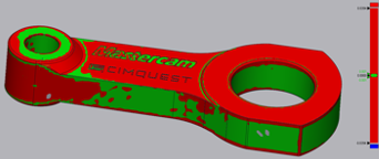
A Go – NoGo Plot is another type of color map that shows what areas are within tolerance and what areas failed. Below is a Go-NoGo plot for the tolerances specified above. This type of color map makes it crystal clear as to which surfaces are within tolerance.
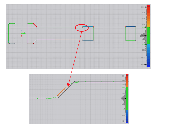
A 2D color map, also known as a Whisker Plot, is a 2-dimensional slice through a model, also utilizing colors and short lines (whiskers) to show tolerance. The CAD model is represented in the black cross-section and the colored section is the scan (see image below). Short lines (whiskers) are drawn normal, from the CAD cross-section to the scan to show the tolerances. The lengths of each Whisker can be readily obtained as well. This is a very revealing method of visualizing manufacturing trends.
In the example below, the tolerance values were changed back to the starting values (+/-.005” for the nominal and the critical to +/-.010”) and a slice was taken right through the center of the model. Notice if we isolate one area, we get a very clear picture as to what took place during the machining process. We can see the flat, machined areas are within tolerance but on the low (undercut) side whereas the chamfer is full (oversize) and deviates outward into the critical tolerance zone. Identical results, as the full 3D color map provides, but with much more clarity as to exactly what has taken place in this zone. Take note of the Whisker colors and lengths below.
 That’s it for this month’s Metrology Minute. Feel free to contact Joel Pollet at Cimquest with any questions.


Leave A Comment